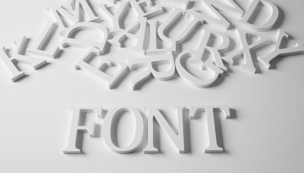
How many fonts should a brand have? Whether you are an aspiring designer or entrepreneur, puzzling around this question is common. The typeface also impacts branding as colors have. Typeface? Okay, let us burst the bubble. The typeface and fonts are not the same thing as you may think; yes, both of these terms are used interchangeably but have different themes.
Read on to learn the font number to thrive a brand, font types, and tips to choose the right one for your brand.
Typeface vs. Font: Clarifying the Terminology

Well, actually, in common to what we consider the font is a typeface. Like Helvetica, it is often referred to as font, but in actuality, it’s a typeface.
The typeface defines the specific lettering style, while fonts are variations of a typeface with sizes and weights.
Let’s understand with an example. Helvetica is a typeface, but the Helvetica 12 and Helvetica 10 size are two different fonts. The same goes for the weight; Helvetica Heavy and Helvetica Medium are two separate fonts.
In addition, widths such as condensed, extra wide, and narrow refer to different fonts. The Italic type is also considered a font.
In a nutshell, typeface has a broader meaning that represents the letter style. Fonts refer to the means by which typefaces vary in size, weight, width, and italics.
Why are typefaces and fonts so important in branding?
Typeface and fonts are everywhere either on brand websites, social media profiles, and marketing materials. The typeface of a business has a vital role in empowering a brand identity.
Customer experiences: A person perceives the brand through its typeface; whether they look at it on the website, advertisement, or product packaging, it’s an experience. Nielson reported that web users complain most about the small size fonts and bad contrast in reading. So, a brand needs to use the right typeface and fonts to have a positive impact on customers.
Typeface has meaning: Like color phycology in branding, there exists font physiology as well. It symbolizes the values, message, and tone of the brand and triggers emotions.
For instance, Serif, the traditional typeface, is easy to read and sparks the feeling of trust, elegance, and authority. At the same time, the Sans serif modern look typeface gives a feeling of minimalism, straightforwardness,s and innovation.
How many fonts should a brand have?
It’s not a hard and fast rule about how many fonts a brand should have, but there are some design basics that you must adhere to.
You might have a unique typeface for your logo, but for web and advertising, you properly need to choose fonts to use consistently. You don’t have to overwhelm your branding with 5 to 7 fonts. In the meantime, 3 fonts can perfectly do the job in branding.
Therefore, don’t mess up your branding with too many fonts; however, you can use different variations of fonts such as bold, medium, light, or italics. Using more than 3 fonts can make a cluttered, messy, and repulsive design.
Also, keep in mind that font usage is all about communicating the right message that your company wants to convey, so choose the typeface according to it. While using many fonts, blur the brand message it wants to convey.
If you use more than three typefaces inconsistently, your brand will look unprofessional. So yes, less is more and creates more impact with consistent use—three fonts (typefaces) are enough to go.
What do typeface and fonts say about your brand?
Before you pick up a typeface for your brand, first understand some basics. What message do you want to convey through your typeface? And you have to choose fonts that represent your company values in addition to a positive customer experience. In this way, you can build consistency over your brand assets and make your company recognizable. Now, let’s sneak peek at the types of typefaces and their lasting impact on the audience.
1. Serif typefaces
Since the printing era, serif typefaces have been there and it’s one of the oldest among all. Serif typefaces have little projections added to the ends of a stroke. Serif typefaces are best for print media due to good readability, as they boost the reading by 15%.
This Serif typeface provokes timeless, cultural, class, and sophisticated feelings about the brand. Additionally, boosts trust and respect for the brands who want to build authority. Times New Roman is a common example of a Serif typeface.
2. Sans serif typefaces
The Sans serif typeface has no projections at the end of the stroke. Sans serif typefaces have a minimal, clean and refreshing look. Sans serif fonts give honest, simple and forward-thinking vibes. These typefaces are easier to read on mobile websites. Arial, Helvetica, and Futura are some popular sans-serif typefaces.
About 73% of Fortune 500 companies use sans-serif fonts in their logos. Open Sans (Google typeface) is an extensively used sans-serif font. It’s one of the well-known Google fonts that has been outstripping 1.5 trillion views for about a year.
3. Script typefaces
Script typefaces match cursive handwriting and have a fancier touch than other typefaces. Brands use script typefaces to be more personal and display elegance, sophistication, and creativity. A brand uses script typefaces to inspire its audience to be creative, bold, and elegant. However, they should not be overused.
Tips to Choose the Right Typeface for Your Brand

Well, you can find a wealth of typefaces that shine in the design despite these three above. Beyond that, more than half a million fonts are out there. So you have a handful of fonts. It was important to use the best typeface as it can make or break a design. We come up with some tips to choose the right typeface for your brand. Here we go;
1. Understand your brand’s personality.
Treat your brand as a person with unique traits and figure out what describes your company to give it a personality. This will squeeze out a large part of fonts that do not match your brand personality. Does your brand sound serious, casual, or sophisticated? Or are you more playful and bold traits? These characteristics will help you find the right typeface that also sparks the same vibe and meaning. The font psychology is real, whether in logo design or other branding aspects. So keep this in mind when shaping your brand personality.
2. Prefer your audience’s interest.
Knowing your audience demographics and interests will help you choose the perfect typeface. For instance, If you sell luxury products and your target audience enjoys shopping at Deluxe, then choosing an elegant and sophisticated typeface can make the cut.
3. Ensure great readability
Actually, it is important to think about the typeface and font readability. Is your font easy to read? Don’t use complex fonts that may look attractive but hard to read, though, as this can negatively impact your brand.
4. Pairing fonts
Less is better for a cohesive brand image, as we have discussed above—no more than three fonts are needed for your brand. However, you can pair the fonts.
One of the well-known pairings is the Serif and Sans-serif typeface. You can pair a sans serif header typeface with a serif body typeface. Moreover, you can choose fonts based on their contrasting weight.
5. Pay attention to size and spacing
Most people overlook the size and spacing of fonts, though it’s vital to help consumers read easily. It would strain the reader’s eyes to skim the information if you don’t consider the size and spacing of fonts. Nielson reported that web users complain most about small font sizes and bad contrast in reading.
Bottom line
Now you have a clear answer: How many fonts should a brand have? Your brand should not use more than 3 fonts as it will clutter the design. And your audience will not grab the message that you want to convey from your design. Since typefaces and fonts have meanings and help your brand to deliver the values that your company holds.
Meanwhile, typefaces and fonts have a big influence on creating brand awareness and recognition through consistent usage, so use them wisely for a positive impact.





Discussion about this post