
Over 93% of buyers emphasize visuals solely while considering a purchase. Colors hugely impact the customer’s mind—and are a powerful tool in marketing. At the same time, color plays a role in crafting a brand image. Whether you are a startup owner trying to connect with your audience or a marketer craving to learn the psychology of color in business, we have got you covered. We’ll dig deeper into color psychology, its benefits, and color psychology in marketing examples.
What is color psychology?
Color psychology is a theory for how color impacts human behavior and feelings. For that reason, colors can provoke you to be happy, feel low, or can spark anger. According to NIH research, red light raises blood pressure, and on the flip side, blue light calms down the person and reduces blood pressure.


However, color psychology can shift depending on consumer preferences and cultural values. When you select the right color for your brand that is tailored to your target audience’s perception, it will help you in marketing down the road.
Different Color Psychology
Red: Red depicts excitement, love, energy, warmth, and action.
Yellow: Yellow can take you to cheer and positivity from the dark and dull. This vibrant hue brings hope, happiness, energy, sunshine, and warmth.
Green: Green presents nature, peace, calmness, and harmony, fostering positivity and faith.
White: White often refers to cleanliness, purity, protection, calmness, comfort, and hope.
Blue: Blue color turns up trustworthiness, integrity, peace, and relaxation.
Purple: Purple symbolizes wisdom, creativity, royalty, power, ambition, luxury, peace, pride, and independence.
Orange: Orange is a color that has a promising and uplifting impact on the human brain. It is linked with warmth, happiness, creativity, enthusiasm, and fun.
Why is color psychology important in marketing?
By implementing the psychology of colors in marketing and branding, you can build effective strategies—and compel consumers to buy. Branding and designing experts execute color psychology and gain worthwhile results. Let’s dive into the importance of color psychology in marketing.
First impression of your product or service
You have 90 seconds to make a first impression of your brand product. In fact, 52% of buyers willn’t return because of the brand’s aesthetic if they don’t like it. So, to make a positive first impression, it’s crucial to create the right color palette that connects with your target consumer.
Color sparks off emotions.
Color sparks off human emotions and feelings. For instance, warm colors like yellow, orange, and red can evoke energy, happiness, comfort, and creativity. And calm colors like blue and green stimulate the feeling of serenity. On the flip side, neutral colors, white and gray, are linked with elegance, simplicity, and calmness.
Brand recognition
Color builds brand identity, and consumers can recognize a brand whenever they see a specific color palette. This will help your brand to excel from your competitors by choosing the right color of brands when marketing a product or service.
Call to action
Colors encourage consumers to click, subscribe, or purchase from the call to action button color. Usually, marketers use red to create urgency, and some use blue, green, or orange to seduce the customers to take action.
Cultural relevance
Different cultural audiences have different perceptions about colors. One color perceived as positive might have a negative perception in another culture. Understanding global cultural associations is vital in global marketing. Indeed, a perfect culture-centric color approach can boost your brand appeal in marketing.
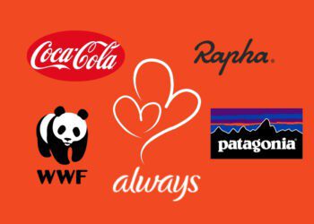
Color psychology in marketing examples
Now, you need to understand how famous brands splash color psychology to stand out. Let’s dig into the color psychology in marketing examples.
Mcdonald (Red and Yellow)

McDonald’s primary colors are red and yellow to enhance the brand’s appeal. The red they apply makes consumers hungry while creating a sense of urgency to buy from them. On the other hand, the logo’s M yellow represents happiness and optimism to customers.
Starbucks (Green & White)

Starbucks is one of the leading brands that uses green and white as primary colors. Green signifies wealth, healing, and nature, while white radiates simplicity and cleanliness. And the mermaid logo connects the customer with nature. Consequently, Starbucks boosts a stress-free vibe while sipping a cup of coffee. They uses different shades of green to market the coffee and drinks that complement its brand identity.
Oral B (Blue)

Oral B, a dental health brand, sells high-quality electric toothbrushes. The brand uses blue to associate with quality, trust, and safety. When customers pick up Oral-B products, they feel reliable and secure. Whether on their website or social media page, Oral B consistently follows their brand blue color.
Hallmark (Purple)

Hallmark created a purple-colored logo to influence their target audience. It features a stylized name, rounded off by a regal crown—symbolizing the company’s special status. Through purple, Hallmark nurtures confidence and trust plus delivers quality and excellence every single time.
Nickelodeon (Orange)

The vibrant orange Nickelodeon logo embodies the imaginative spirit and excitement that is essential for kids. Orange is the perfect color to represent their brand, as it evokes creativity and a sense of playfulness that aligns perfectly with the kids. Along with orange, Nickelodeon also uses purple as its primary color, which can be seen in its marketing.
How do you use color psychology to improve your marketing?
Now you have an idea of color psychology in design and how color can impact your marketing. Generally, different colors convey different emotions. Determining which colors are mind-blowing for your marketing strategies tailored to your target consumer would be best. Let’s discover how to use color psychology to improve your marketing.
Pick a Color that Connects with your Audience.
First, know your target audience’s color preferences; the hues that fit their taste can help you find the perfect colors. The color preferences roll in according to age and gender. Following your target consumer can spice up your color game in marketing.
Prefer a Color that Specifies Your Brand’s Personality.
The color also reflects your brand personality- the identity you want to sketch in front of customers to build authority. Therefore, wisely choose a color palette that points out your brand characteristics.
Consistency in Product Color
Follow consistent color in your packaging as well as in all communication channels. A discrepancy between the expected and delivered product color can throw away your customers.
Color with a Melodic Name.
Color with melodic names catches new hipe in the industry. The study also reveals that consumers prefer products with fancier color names rather than generic ones. If you have a cosmetics, clothing, or paint brand, choosing a catchy color name in marketing can help you excel in the industry.
Takeaway
These color psychology in marketing examples help you to get better insights. Color can shape up or ship out your marketing campaigns. If you apply color psychology wisely, your brand can be the next big brand that customers will love to explore and buy.


Discussion about this post